

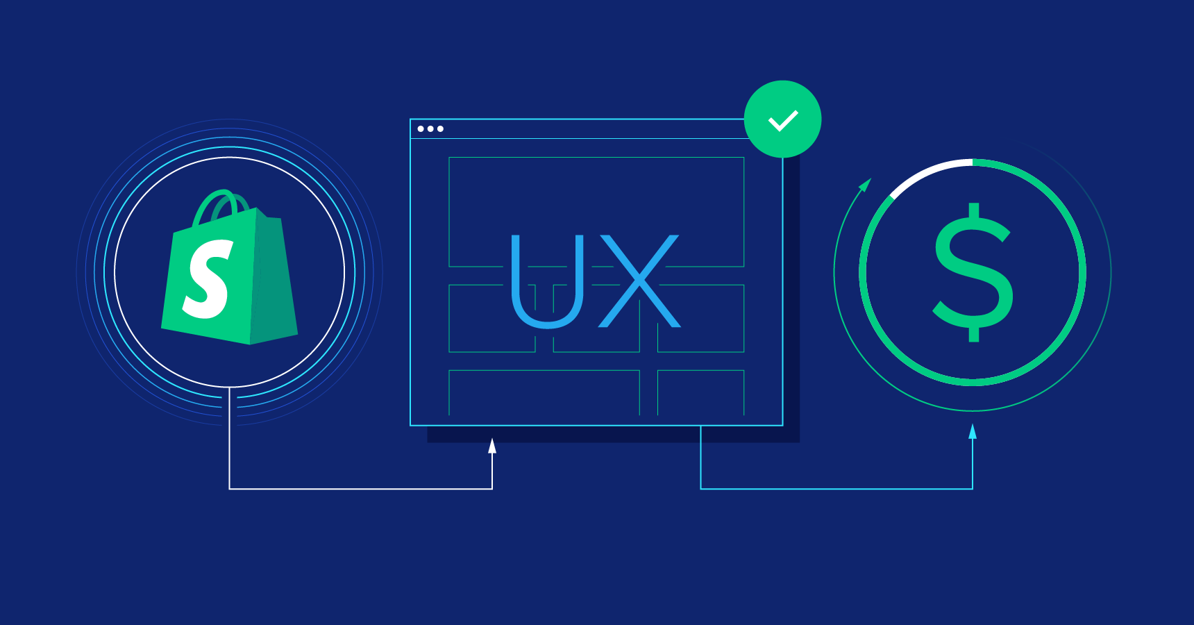
5 On-Site CRO Tactics to Boost Shopify Sales

Most Shopify stores don’t have a “traffic problem.” They have an on-site conversion problem.
You can run ads, post daily on social, and even rank on Google—yet still watch visitors bounce, abandon carts, or buy only one low-margin item. The reason is simple: ecommerce shoppers are making dozens of micro-decisions every time they land on your store. If the experience feels uncertain, slow, or confusing, they leave. If it feels clear, confident, and personalized, they convert.
This guide breaks down five proven on-site conversion rate optimization (CRO) strategies you can implement on a Shopify store to increase sales and improve customer experience. Each tactic is designed to work with how real people shop: they want clarity, reassurance, and a reason to act now—without being pressured or tricked.
If you’re building your store foundation (themes, checkout, apps, analytics), start with Shopify and treat CRO as an ongoing system, not a one-time tweak.

Use Countdown Timers Without Feeling Spammy
Countdown timers work because they create a clear boundary around an offer. Shoppers don’t need to “think about it later” when the store communicates a real deadline. That deadline turns browsing into decision-making.
The mistake is using countdown timers everywhere, all the time. That makes the store feel like a perpetual clearance rack. Instead, use timers when there’s a legitimate reason for urgency:
- Limited-time sale (weekend promo, end-of-season clearance)
- Product launch window (new collection drops this week)
- Shipping cutoff (order by X date for delivery by Y)
- Low-stock item (only when inventory is genuinely low)
Where to place it:
- Product page near price/add-to-cart for a specific item
- Cart page when the promotion applies storewide
- A small announcement bar at the top of the site for seasonal deadlines
Best practice: Pair the timer with one sentence of context. Not “Hurry!” but “Sale ends Sunday at midnight” or “Order by Dec 18 for on-time delivery.” That turns urgency into clarity.
Add Threshold Banners to Lift Average Order Value
Threshold banners are one of the cleanest ways to increase average order value (AOV) because they turn your offer into a small “progress game.” Customers see exactly how close they are to unlocking a benefit—so adding one more item feels logical, not forced.
Common high-performing threshold offers include:
- Free shipping (spend $X to unlock)
- Free gift (spend $X to receive a bonus)
- Tiered discount (10% at $X, 15% at $Y)
- Bundle unlock (add one more item to complete a set)
Where it works best:
- Cart drawer/cart page (highest intent zone)
- Sticky bar during a promotion (keep it subtle on mobile)
- Checkout-adjacent messaging (if your theme supports it cleanly)
How to make it feel premium: Don’t shout. Use calm copy like “You’re $12 away from free shipping.” The tone matters—especially for beauty, wellness, and premium lifestyle brands.
Operational note: If you offer free shipping thresholds, make sure your margins and shipping rates support it. AOV gains should not be canceled out by fulfillment costs.

Show Cart Reminder Popups for Returning Visitors
Not every shopper buys on the first visit—especially in categories with longer consideration cycles like skincare routines, home goods, pet subscriptions, or higher-priced items. Many customers browse, compare, get distracted, then come back days later.
A cart reminder popup helps returning visitors “resume” their journey instead of starting over. It’s one of the most practical personalization moves because it reduces friction: no searching, no re-finding, no re-deciding.
What to include in a cart reminder:
- Product thumbnail + name + key variant (size/color)
- Quick actions: “View cart” and “Checkout”
- Optional reassurance line: “Shipping calculated at checkout” or “Free returns within 30 days”
Rules that keep it from annoying people:
- Only show it to visitors who actually added items before
- Delay it a few seconds after page load
- Make it easy to dismiss and don’t re-trigger repeatedly
Think of this as a convenience feature, not a “popup tactic.” The goal is to help serious buyers pick up where they left off.

Make Shipping and Returns Unmissable
Many carts don’t get abandoned because the customer “changed their mind.” They get abandoned because the store failed to answer basic questions early enough—especially shipping costs, delivery timelines, and returns.
If shoppers are surprised by shipping fees at checkout, trust drops instantly. If they can’t find return terms, they assume the worst. Transparency is a conversion strategy, not a legal detail.
What to surface clearly:
- Shipping cost logic: flat rate, calculated, or free over a threshold
- Delivery estimates for major regions (even ranges help)
- Return window and conditions (e.g., unused, original packaging)
- Exchanges and how fast they’re processed
Where to place it:
- Product page near the buy button (small “Shipping & returns” expandable section)
- Cart page as a short banner (“Free returns within 30 days”)
- Footer links remain useful, but don’t rely on them alone
Seasonal tip: During peak gifting periods, add an order-by cutoff banner. It reduces support tickets and increases purchase confidence.

Use Intelligent Product Recommendations Across the Funnel
Product recommendations are not just “nice-to-have widgets.” When implemented thoughtfully, they guide visitors through discovery, increase AOV via cross-sells, and improve retention by showing customers what to buy next.
The key is matching recommendation type to shopper intent.
High-impact placements and what to show:
- Homepage: best sellers or “popular right now” to reduce choice paralysis
- Collection pages: “top rated” or “staff picks” to guide browsing
- Product pages: “frequently bought together” and “you may also like”
- Cart: low-friction add-ons (small items, refills, accessories)
- Post-purchase: replenish reminders or complementary items (email + on-site account area)
Rules that keep recommendations from hurting conversions:
- Don’t overload the page—especially on mobile
- Exclude out-of-stock items automatically
- Avoid showing near-duplicates (it feels repetitive)
- Prioritize relevance over “whatever is profitable”
When shoppers feel the store “understands” them, they explore more and hesitate less. That’s the real power of personalization.
How to Implement These Tactics Without Breaking UX
One CRO trap is stacking too many widgets until the site becomes noisy. The best-performing Shopify stores usually have fewer elements—but each element is placed intentionally.
Use this rollout sequence:
- Start with clarity: shipping/returns messaging + clean product page layout
- Then increase AOV: threshold banner + cart add-ons
- Then add urgency: timers only when there’s a real deadline
- Then personalize: cart reminders + recommendations
Measurement tip: Track conversion rate, AOV, and revenue per session before and after each change. Don’t launch five features at once—otherwise you won’t know what actually improved performance.
Final Thoughts
On-site CRO is not about gimmicks. It’s about reducing uncertainty, increasing momentum, and making buying feel easy. When you combine urgency (timers), motivation (threshold rewards), convenience (cart reminders), trust (shipping/returns clarity), and personalization (recommendations), you build a store experience that converts better at every traffic level.
If you’re ready to build a store that can scale with these tactics—checkout, apps, analytics, and a strong ecosystem—start with Shopify and treat optimization as a weekly habit, not a one-time project.


